Summary
- Android 16 introduces a bold new look with a blur-heavy Quick Settings panel and customizable tile sizes.
- The status bar and battery icons get a fresh design, with signal icons segmented and battery percentage inside.
- Home and lock screen customization now offers better previews, icon resizing, and unified clock style controls.
For the past few years, Android has started to feel a bit too familiar. In earlier versions, each major Android release brought a visibly different design, but recently, Google’s design language has stabilized, and new versions haven’t felt all that new, even with a jump in version numbers.
That’s starting to change with Android 16. Well, not immediately. A week before Google I/O 2025, Google hosted its pre-I/O Android Talk Show, where it unveiled its new design language, called Material 3 Expressive. This is a bold shift for Google, introducing much bolder UI elements than the minimalist style we’ve grown used to on Pixel phones.
And right after Google I/O 2025, the company released the first Android 16 QPR1 beta, which is the first major update to Android 16 and includes these Material 3 Expressive UI changes. I installed the Android 16 QPR1 beta on my Pixel 9, and here are the 5 big visual changes coming to Android phones later this year.
Related
5 Android apps I delete immediately from every new phone
I hate clutter almost as much as I hate superfluous apps — here are the defaults that I always delete when setting up a new Pixel phone.
5
Quick Settings and notifications get a new look
Say hello to a new frosty blur design
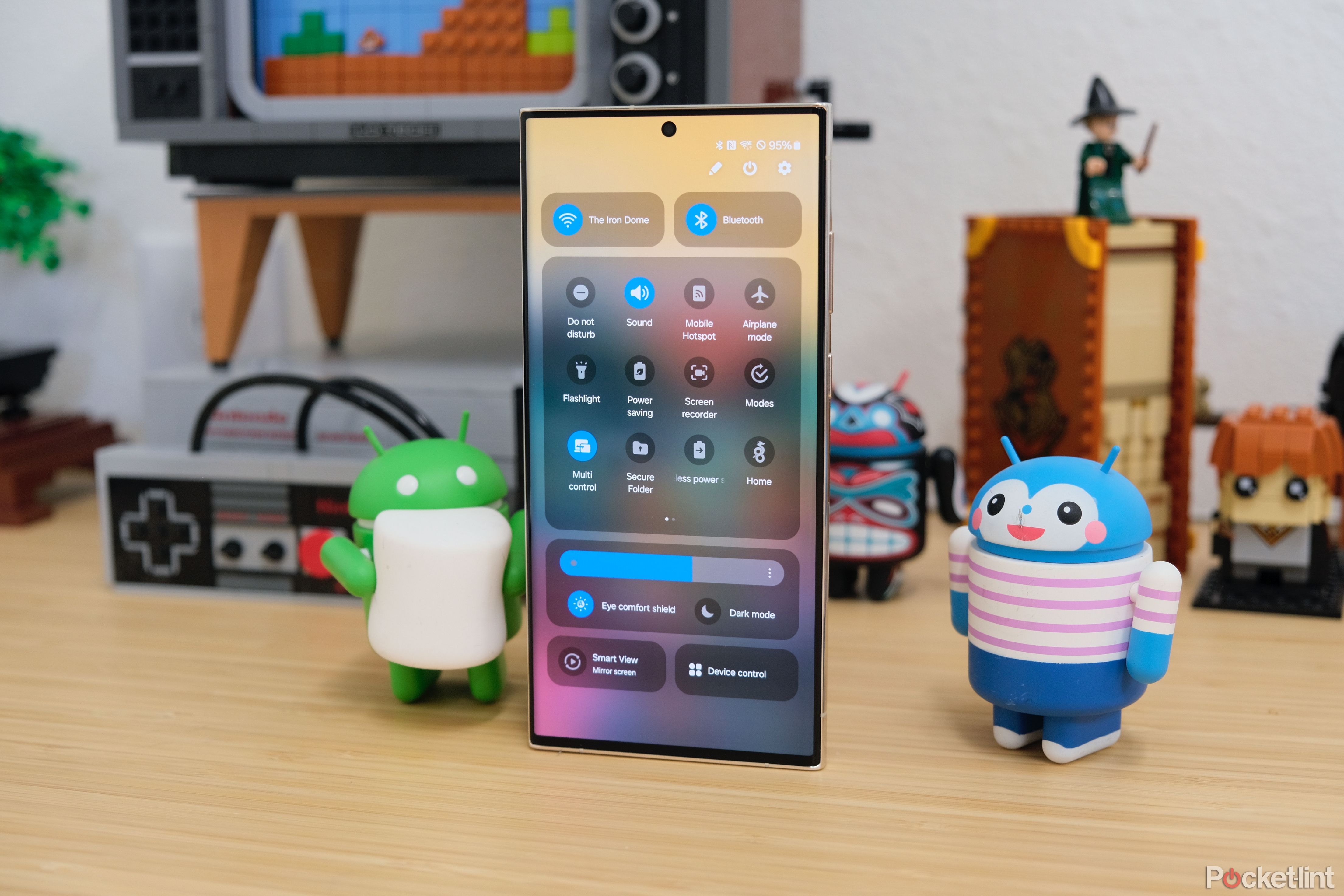
The most noticeable user-facing change in Android 16 is the revamped Quick Settings and notification panel. For years, Google used a solid background design, but that’s now replaced with a blurred, translucent look. The toggles are bolder, and when Dynamic Theming is enabled, they’re color-coded too.
The previous design was clean and simple, but also a bit bland. Now, the new panel feels far more customizable. You can use both large and small tiles for the Quick Settings toggles, mix and match them freely, and place them however you want — something that honestly feels a bit inspired by iOS 18.
The Wi-Fi and Bluetooth toggles now support single-tap actions: tap the circled icon to toggle, or tap the rest of the tile to open the familiar settings dialog. Just above these toggles, the brightness slider has changed too — it’s now more of a sharp-edged rectangle, and includes a draggable line, which feels a bit awkward in the overall design.
Notifications haven’t seen much change, but swiping now feels smoother and more intuitive. There’s also a prominent “Clear All” button at the bottom to dismiss everything. Overall, I love the new Quick Settings customizability, but the blur effect feels a bit too much. Even after hours of use, it feels more forced than natural — perhaps Google’s trying to bring the Pixel UI closer to Samsung’s One UI 7?
Related
How to see which Android apps are running from Quick Settings
By closely monitoring the apps running in your Android device, you can easily avoid speed performance issues and improve battery health.
4
The volume panel is now bold and more polished
Bigger buttons and better layout all around
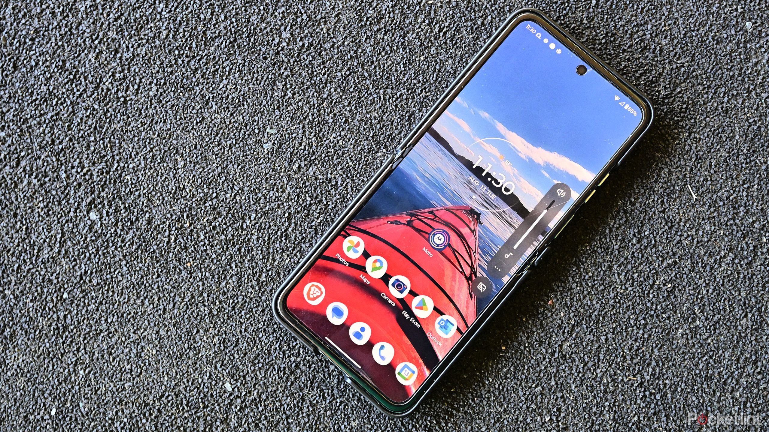
The same bold design theme carries over to the volume panel as well. A single tap opens the side panel, which now features a new icon and a vertical volume slider similar to the new brightness slider, complete with a prominent draggable line.
Tapping the three-dot menu reveals the familiar full-volume controls. The updated panel features slightly slimmer bars for media, call, ring, and notification volumes. Functionally, it’s not a major shift from before, but the Material 3 Expressive design language is clearly present here too.
Related
How to change the audio output on an Android phone
Changing volume on your Android device is an easy process, here’s how.
3
Status bar icons are finally getting a refresh
The vertical battery icon is gone, and more tweaks are coming
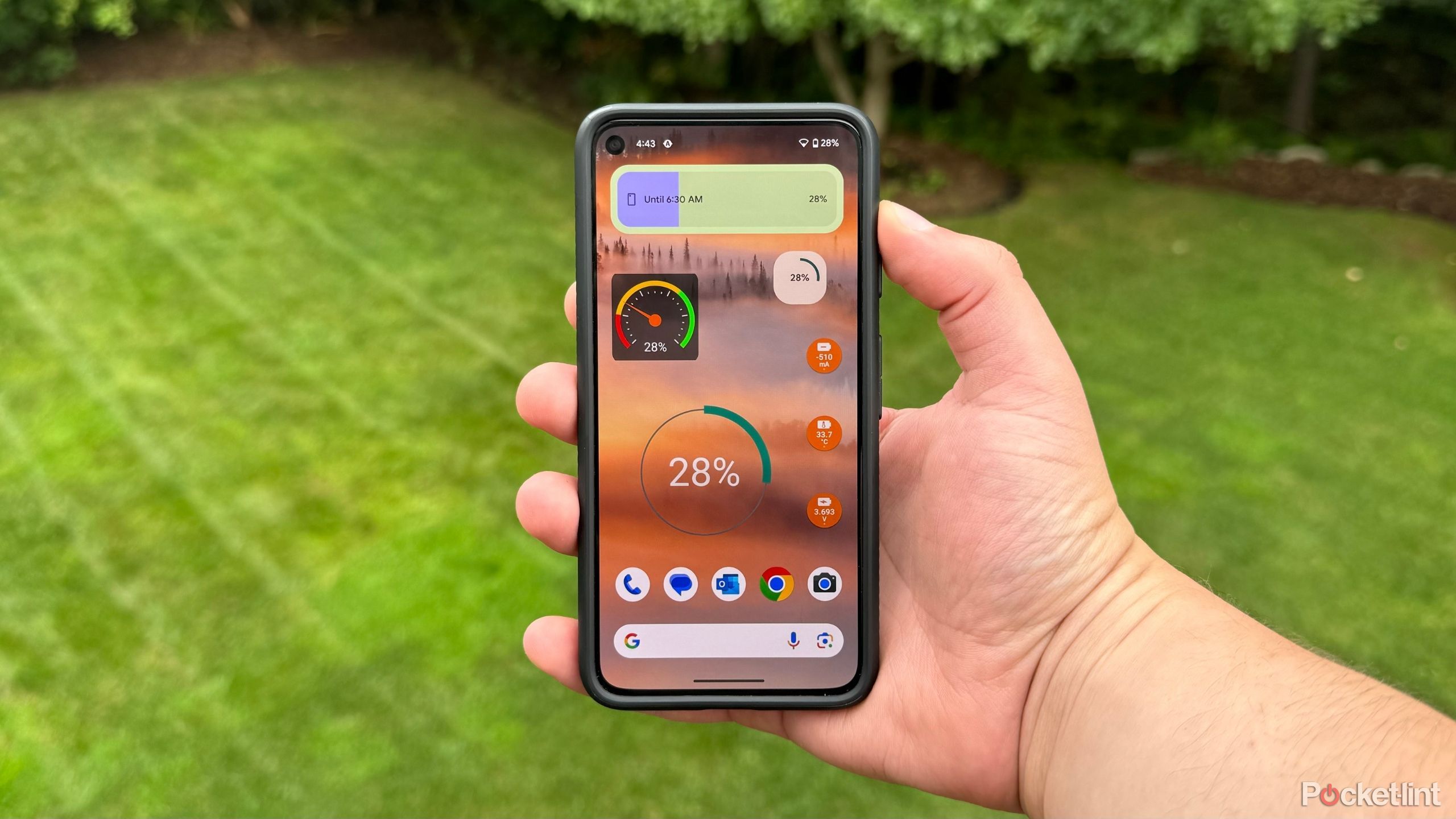
For years, Android has used the same solid status bar icons, but that’s changing in Android 16. The new Wi-Fi icon is now broken into segments, similar to iOS and One UI, to reflect signal strength better. The same applies to the cellular signal icon.
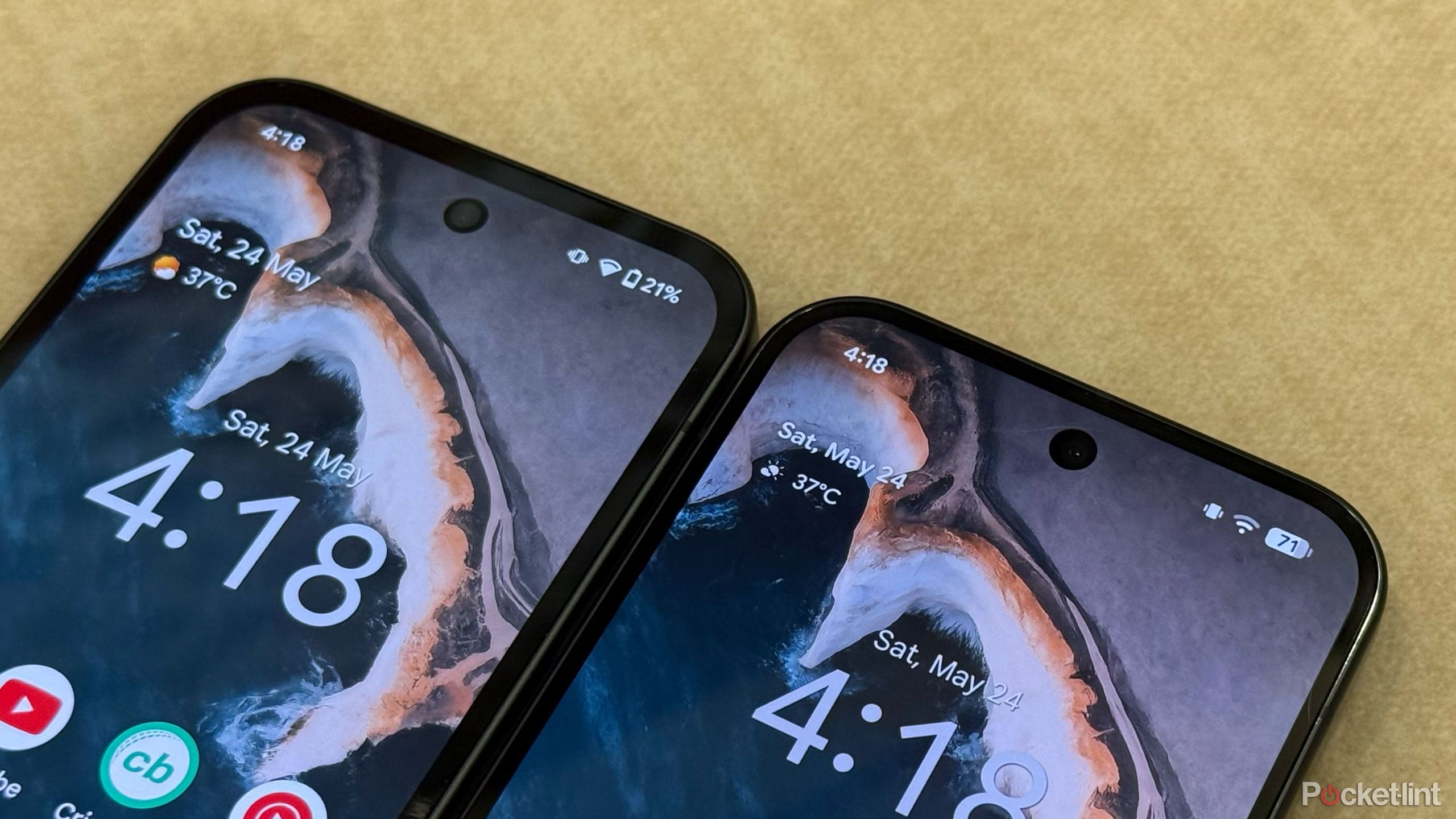
The battery icon has also received a significant redesign. Instead of the vertical bar with percentage outside, Android 16 now uses a horizontal battery icon with the percentage displayed inside, much like newer iOS versions. It turns green while charging and red when below 20%.
I like the new battery icon, but it would’ve been nice if Google gave users the option to revert to the old icon set, especially considering Android’s known customization flexibility.
Related
5 Android battery widgets that help keep my phone powered up
I never run out juice when I have one of these trusty battery widgets pinned to my Android home screen.
2
Wallpaper and style options get a big update
Lock screen and home screen get new tools
A major change in Android 16 is coming to home screen and lock screen customization. Right from the first boot, you’ll now notice an extra row available to place an icon or widget. By default, Android 16 uses the “medium” icon layout, which is essentially a 4×5 grid.
Beyond that, the Wallpaper & Style menu has received a complete overhaul. The preview is now much larger, giving you a clearer idea of the changes you’re making. Color themes, which were previously located just below the preview, have been moved further down, while the wallpaper section now appears at the top with large, bold previews, making it more obvious how to change them.
You can also now change the shape and size of icons, though only the circle option is available at the moment. The full feature to switch icon shapes hasn’t gone live yet.
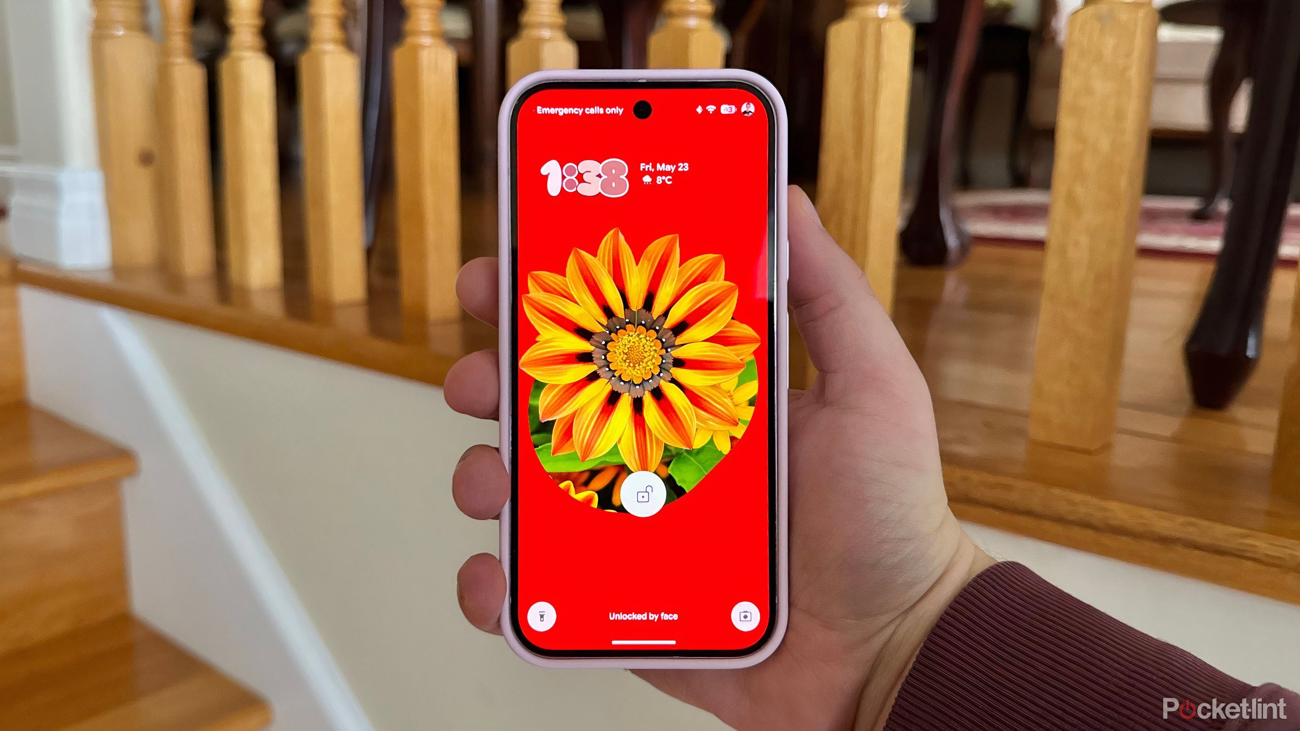
On the lock screen side, the core functionality is mostly the same, but the UI has been streamlined. You can now select a clock style, color, and size from a single screen, instead of toggling between screens like before. There’s also more granular control over the clock size.
As for the Pixel Launcher, not much has changed. The At a Glance widget is slightly smaller, and the blurred background design now appears in the app drawer as well. Home screen settings have otherwise remained the same.
Related
Google’s new Magic Portrait feature is a Pixel-perfect delight
Bar none, Google’s new Magic Portrait feature is my favorite Material 3 Expressive addition to Android.
1
Settings app adds color but keeps the layout
Same layout, but a bit more visual flair
Pocket-lint / Google
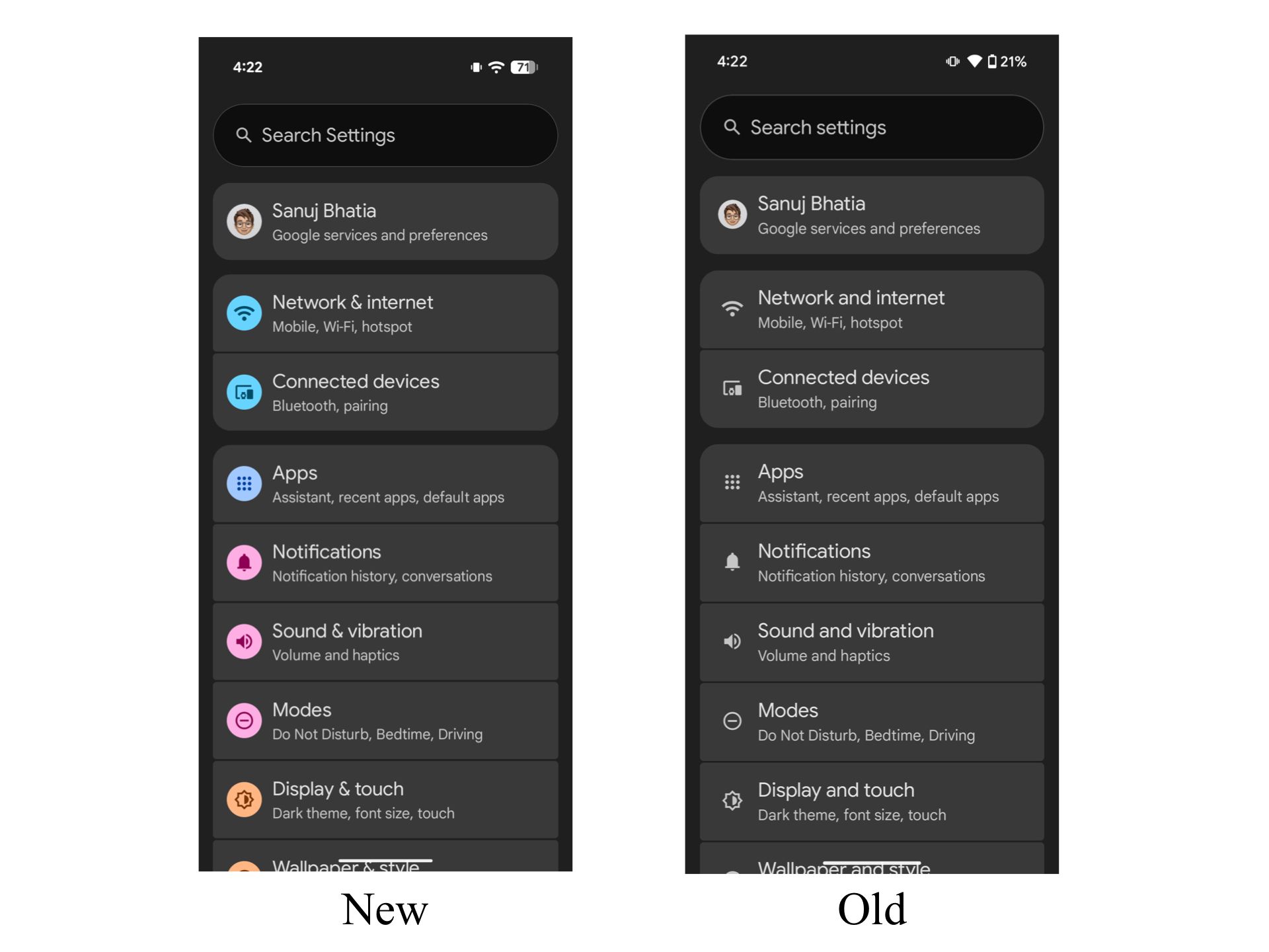
Finally, the Settings app has also received a small design update. While the overall layout and categorization remain the same, the icons for sections like Network & internet, Connected devices, Apps, and more now feature colorful new icons. Interestingly, these colors don’t yet adapt to the system’s color theme, but Google may add that in future updates.
On the whole, Android 16 marks a significant shift from the minimal, bland design language we’ve seen in recent years. I’m still not completely sold on the new design yet, but once Google apps — and eventually other major Android apps — adopt the new style, the system might start to feel much more cohesive and natural.
Related
These 5 lesser-known settings keep me firmly on team Android
The Android OS is brimming with under-the-radar toggles and settings — here are the ones I always make use of on every phone.
Trending Products
SAMSUNG FT45 Sequence 24-Inch FHD 1080p Laptop Monitor, 75Hz, IPS Panel, HDMI, DisplayPort, USB Hub, Peak Adjustable Stand, 3 Yr WRNTY (LF24T454FQNXGO),Black
KEDIERS ATX PC Case,6 PWM ARGB Fans Pre-Installed,360MM RAD Support,Gaming 270° Full View Tempered Glass Mid Tower Pure White ATX Computer Case,C690
ASUS RT-AX88U PRO AX6000 Twin Band WiFi 6 Router, WPA3, Parental Management, Adaptive QoS, Port Forwarding, WAN aggregation, lifetime web safety and AiMesh assist, Twin 2.5G Port
Wireless Keyboard and Mouse Combo, MARVO 2.4G Ergonomic Wireless Computer Keyboard with Phone Tablet Holder, Silent Mouse with 6 Button, Compatible with MacBook, Windows (Black)

Acer KB272 EBI 27″ IPS Full HD (1920 x 1080) Zero-Body Gaming Workplace Monitor | AMD FreeSync Know-how | As much as 100Hz Refresh | 1ms (VRB) | Low Blue Mild | Tilt | HDMI & VGA Ports,Black
Lenovo Ideapad Laptop Touchscreen 15.6″ FHD, Intel Core i3-1215U 6-Core, 24GB RAM, 1TB SSD, Webcam, Bluetooth, Wi-Fi6, SD Card Reader, Windows 11, Grey, GM Accessories
Acer SH242Y Ebmihx 23.8″ FHD 1920×1080 Home Office Ultra-Thin IPS Computer Monitor AMD FreeSync 100Hz Zero Frame Height/Swivel/Tilt Adjustable Stand Built-in Speakers HDMI 1.4 & VGA Port

Acer SB242Y EBI 23.8″ Full HD (1920 x 1080) IPS Zero-Body Gaming Workplace Monitor | AMD FreeSync Expertise Extremely-Skinny Trendy Design 100Hz 1ms (VRB) Low Blue Gentle Tilt HDMI & VGA Ports
